-
Architects: Teo Yang Studio
- Area: 27 m²
- Year: 2022
-
Photographs:Studio Sim
-
Manufacturers: Erco, Revox
-
Lead Architect: Teo Yang
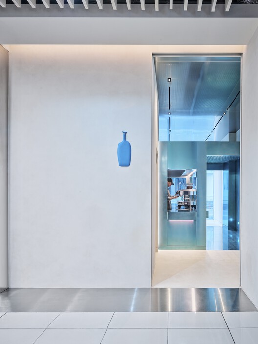
Text description provided by the architects. Located within Seoul’s bustling commercial street, Blue Bottle Coffee Myeongdong initiates a dialogue between the city’s rich heritage and modern Korean culture through a narrative-driven approach. Passerbys are greeted by a gleaming white, high narrow facade that subtly glows Blue Bottle’s iconic logo silhouette—strikingly contrasting with its busy surroundings. We wanted to create a simple and unified exterior that speaks the spatial philosophy of 'Jakyung' by taking a metaphor from the heritage of Korean traditional architecture ‘Hanok.’ People are guided into the space through the house nameplate (Hyeonpan) and entrance gate that gradually leads people into the space itself. To reinterpret the story of tradition, we extended the idea of the ‘Hyeonpan’ by establishing a visual guide through the glowing square logo window.
The 'Blue House' is a self-standing structure with openings on its sides that resemble the doors and windows of a traditional Korean home. Cladded in custom metal panels, the structure subtly reflects its surroundings while illuminating a soft bluish hue on the stainless steel cladding ceiling and floor.
Upon entrance, visitors are invited to walk through the 'Blue House.‘ The coffee preparation bar is housed within the structure, cladded in stainless steel to create a timeless yet new impression of Blue Bottle Coffee—immersing guests in the delicate process of crafting coffee. Near the entrance of the ‘Blue House,’ the merchandise shelf’s simple geometry resembles a contemporary sculpture, effectively highlighting the curated selection of Blue Bottle merchandise.
Passing through the service & merchandise area, the sub-ceiling of the 'Blue House' is made of custom-finished aluminum grating panels to filter off the harsh direct lights from the main ceiling, while adding visual depth to the space through the subtle shadows and reflections as a whole. At the end of the corridor, visitors are offered an inside look at the custom logo signage-making process by artisans Deok-Ho Kim & In-Hwa Lee. Guests are offered a visualization to better appreciate the craft of ceramics while waiting for their order. This experience is made tangible as the custom signage meets people upon exit. Adding a thoughtful and emotive quality of craft, the smooth surface and hand-touch of the logo leaves guests with an artistic and personal impression of Blue Bottle Coffee Myeongdong.
The linear flow of this store ensures visitors walk through the structure easily & efficiently, crucial for this compact grab-and-go typology. A simple circulation was designed in consideration of the small space to prevent congestion inside. From the facade to the exit, every aspect of the store is designed to correspond with the bustling context of Myeongdong. To overcome the limited space, we wanted to altogether create a relaxing environment through the use of simple architectural shapes and concise materials. As one holds a cup of coffee inside Blue Bottle Coffee Myeongdong, we hope to offer people a moment to pause and rest in a refreshing, memorable environment.
How have the principles of 'Jakyung' and 'Chakyung' been implemented throughout the designs? Jakyung (oneself becoming the scenery) was a very common thing in the past when we had more abundance of space to enjoy the architecture. Such as when you are in the countryside and as you approach a house, the house itself becomes an object of viewing and admiration giving you the pleasure of walking towards it. Not the most common find in the city of Seoul filled with high-rise buildings standing very close to one another. Rather than using the glass facade as a show window to display merchandise, we wanted to create a small blue structure to create curiosity and also to develop a distinctive way of meeting our visitors. Chakyung means borrowing the outside view to accentuate the interior space. We wanted to use the simple structure of the Blue House to frame and capture many different moments in the store. Through the framing effect of the Blue House the busy view of the city, the delicate coffee-making process by the baristas, and also people patiently ordering and waiting for their coffee will become sceneries that makes the store more special and engaging.
Why choose to work with Deok-Ho Kin and In-Hwa Lee on the nameplate? Deok-Ho Kim and In-Hwa Lee have been researching and studying Joseon Dynasty's traditional White Porcelain technique for a long time. Truly understanding the simple and serene beauty of Joseon Dynasty's craft and not just borrowing the aesthetic of the old word makes their work stand out. Their endeavor towards academic approach, cultural underrating and admiration towards simplicity made me feel they are the right people to collaborate with Blue Bottle Coffee's project. Also, they recently had an exhibition dedicated to Blue, experimentation of adding various hues of blue to the white ceramic, which makes them even more of a perfect fit for the project.
The nameplate of the house held a very special meaning in the past Korean tradition, it was a proper and formal gesture to have a well-made nameplate and the quality of the nameplate often showcased the taste level of the landlord. We wanted to bring back the tradition of having a well-made nameplate on the facade of the store. This blue nameplate is crafted by local artisans using local traditional methods and will be a great tool to convey how much Blue Bottle Coffee respects and honors local culture and tradition.